TONGUE
Student project, 2019
Label Design & Illustration
Label Design & Illustration
The most important thing about beer is the taste. This remains on our tongue even after the last sip from the bottle. But a beer is much more than just the taste. It is the attitude towards life that is created at this time. An interplay of all our senses and emotions.
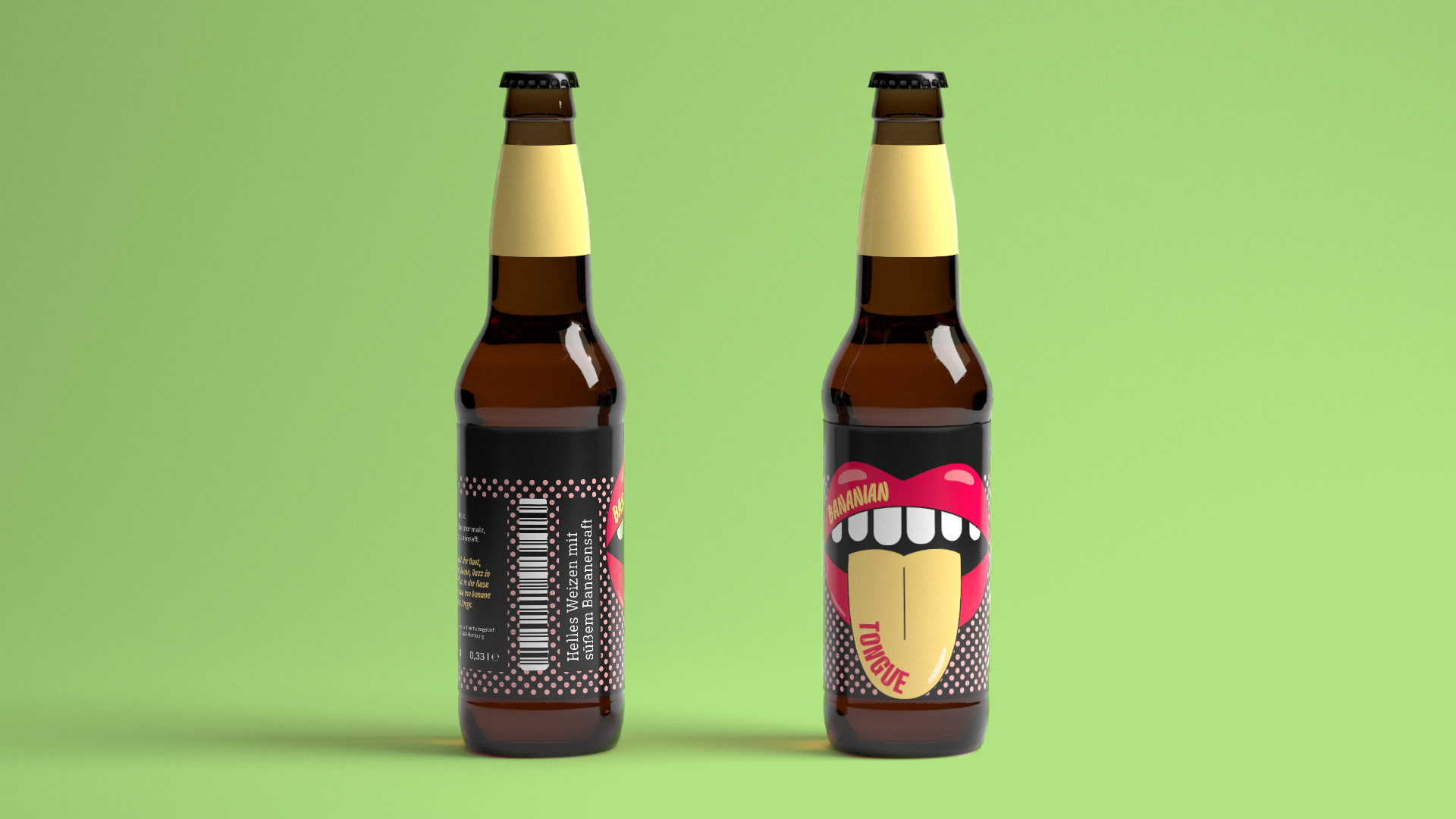
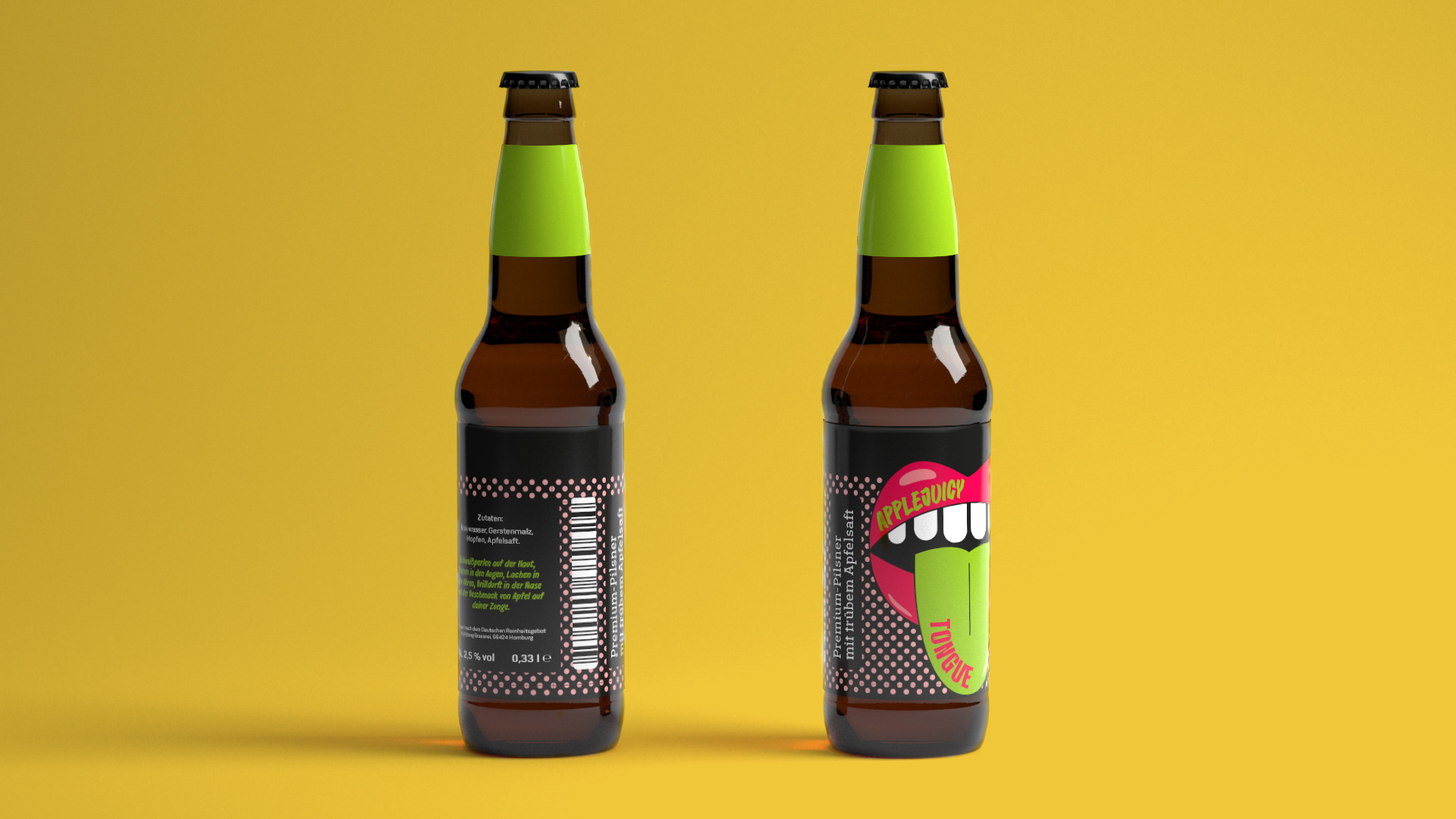
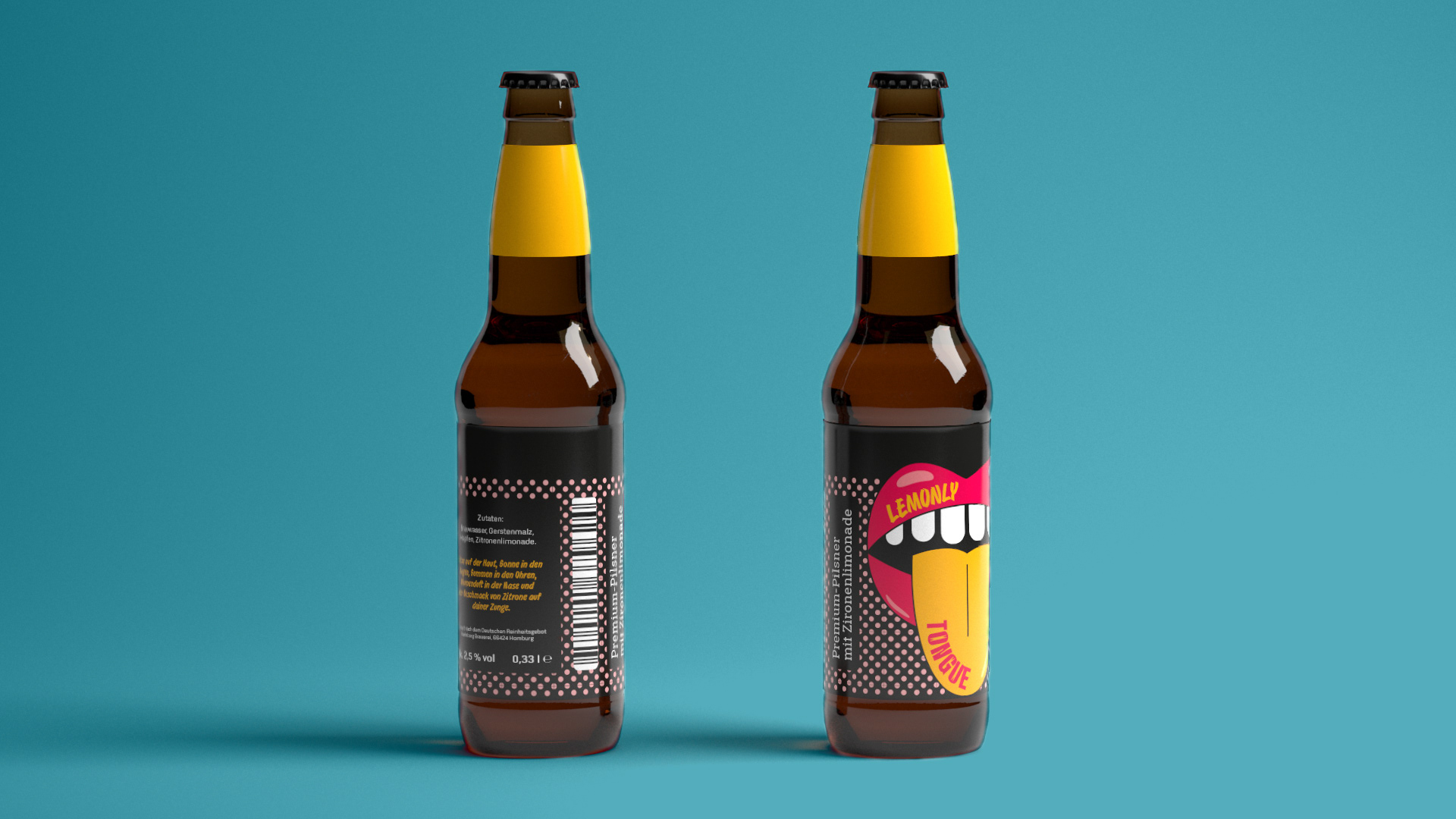
The fictitious beer brand »TONGUE« has taken these approaches to heart and created a series of beers which delicious taste may linger a little longer on the tongue. These are exclusively mixed beer drinks made from premium beers and fresh juices and lemonades. Through the fresh and individual brand identity, it not only creates an identity for beers but captures the feeling while drinking.
The design is inspired by the pop art style. The bright colors on the dark brown glass make the bottle jump directly into the eye. The outstretched tongue supports the cheeky and loud character of the brand. The changing colors of the tongue and the label on the bottle neck identify the different flavors.
Short texts on the back of the bottle indicate the situation in which the beer is best enjoyed and thus represents a kind of consumption recommendation. Here, the different sensory organs and sensory impressions are again addressed. All this gives the brand a unique cheerful character.
One goal of the project was to combine as many fonts as possible. For this purpose, the Playtype foundry provided its fonts within the project.